Sothebys
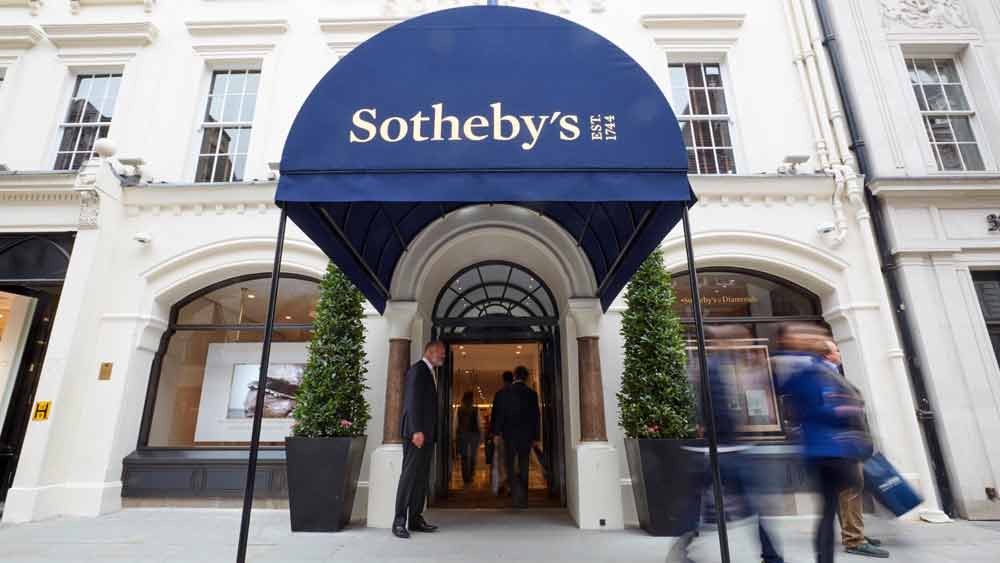
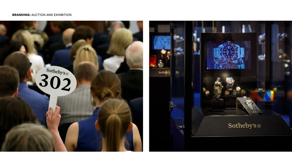
The Sotheby’s Wordmark was designed by Pentagram in 2014. It is the core expression of Sotheby’s graphic identity that consumers and business associates recognize and connect with the Sotheby’s brand. The Sotheby’s Wordmark is the foundation for all other organization identifiers. Navy blue and Yves Klein blue are the defining colours of the Sotheby’s brand and are dominant in most communications.
The in-house teams in London and New York worked together to create an effective visual identity program that both solidifies and amplifies Sotheby’s role within the global luxury art market. We created comprehensive Brand Guidelines and set in place templates that were then communicated globally. We then continued to monitor, adapt and execute roll-out across all aspects of the business.
ITEMS -
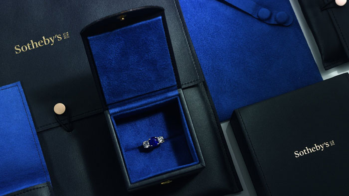
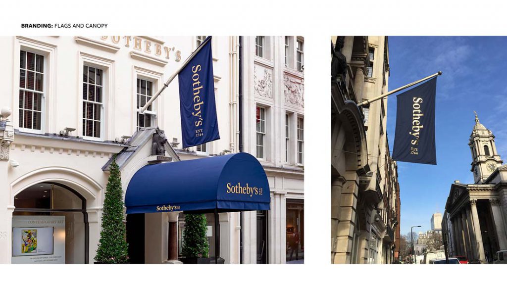
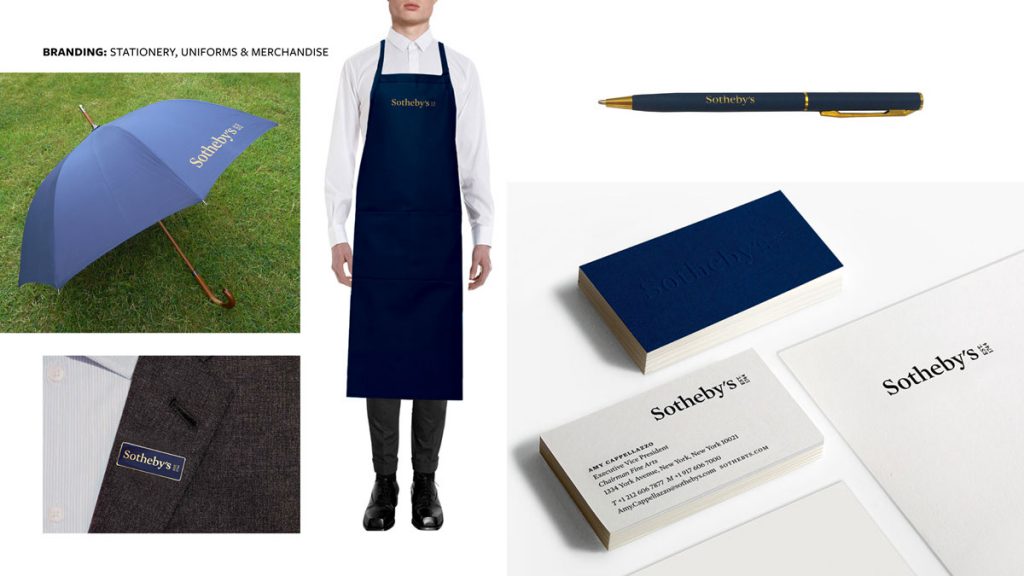
Bags | Packaging l Pens | Flags | Umbrellas | Uniform | Stationery | Badges Forms | Tickets | Hats
CREDITS -
Sotheby’s Creative & Marketing teams
Creative Direction: Liz Thorp & Sandra Burch
Lead Designers: Christina Freyss, Justin Petry
Award: Winner of GDUSA’s 2018, 55th American Package Design Award.
